What fonts for children's books?
Well, it depends!
What fonts should you use for the cover and interior of your children’s books? What size?
Well, it depends. I’m sorry there’s not a definitive answer, but it really depends. How many words are in the story? Who is the audience? What kind of mood do you want to convey?
Best Picture Book Fonts
Picture book manuscripts are generally 500 words or less, and the story is laid out in a 32-page format. With a title page, half-title page (optional), copyright page, dedication page (optional), you have about 14 double-page spreads for the story, along with the last page 32. If you follow that standard format, you can generally use an 18 pt or larger font. Unless you plan to make the typography part of the art, it should be the same size on every page. Of course, if you plan to change the color of some words, bold others, and make some huge, then—well, do what you think is best for the book’s design.
For example, here’s a page from THE BOOK WITH NO PICTURES, by B.J. Novak.
As for fonts, you need to know the difference in a serif and non-serif font. Serifs have the small lines at the bottom of the letters that are meant to help you scan along a line of text. The image above has serif fonts. Non-serif fonts do not have that.
Either type of font works in a children’s picture book, but if you have very short text, the non-serif fonts might work better. If there’s lots of text (I told you, it depends!), a serif font will make it easier to read.
After that—it’s a wild west out there and you can choose any font you like.
To make it easier, though, I’ll give you some to start with that I’ve used, in no particular order:
SERIF fonts:
Myriad Pro
Georgia
Plantin Infants
Alegreya
Garamond Pro
Crimson
Baskerville Old Face
Century Schoolbook.
NON-Serif fonts:
Andika (free Google font)
Helvetica
Gill Sans
Quicksand
Century Gothic
Avenir Next
Lato
The goal of choosing a font in a children’s book is one thing: legibility. Since a child will try to read it (even for preschool books where the parent reads aloud, kids need to be trying to decipher parts of the text), it must be legible. Nothing blurred, smudged, twisted, distorted, or otherwise compromised. Legible. Period.
Dyslexia fonts: Should you use a font that is designed to be friendly to dyslexia? Research shows that sans serif (Verdana, Garamond, Helvetica, Computer Modern Unicode, monospaced (Courier), and roman fonts (Arial, Times, Myriad) help dyslexic readers. They also found that reading was significantly impaired when italic fonts were used. Significantly, fonts designed to be used with dyslexic readers such as OpenDyslexic, were found to be clunky and difficult to read. See this research also.
READ NEXT: Here are popular posts on IndieKidsBooks:
Here’s a book that I recommend to beginners because it lays out the principles of great graphic design: The Non-Designer’s Design Book. It has simple, effective lessons that you can speed through. You’ll learn a lot - fast!
Best Display Fonts
Those suggestions are for the interior of the book. There’s another class of fonts, the display fonts. These are meant to be big and bold, so they are suitable for the title on the cover. For these - go where ever you want! Don’t stick with the tried and true for the titles; instead, go for something that evokes the mood of the book. Depending on the length of your title, try the size at 48 pt, or push it up to 100 pt. Generally, I try to fill the width of the page, while staying within the safe print margins.
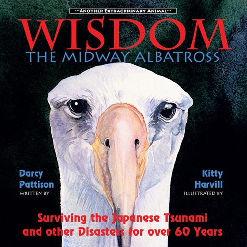
For example, on Wisdom, the Midway Alabtross and other books in the Extraordinary Animal Series, I used Charlemagne Std (90 pt) for the animal’s name and Lithos Pro (38 pt) for “The Midway Albatross.” The author/illustrator names and the subtitle are in RevueBT. Interior text is Minion Pro, semibold, 24pt.
Is this the perfect font choice for the interior and exterior of the book? I don’t know. If I designed this again today, I’d use fewer fonts. But the book works and sells well. In the end, that’s all you can ask of your fonts, to help you sell your book.


